Exploratory Data Analysis
Colab Link
Descriptive Statistics
It's important to explore the data before starting making prediction models. Describing basic features of the data and obtaining short summaries about the samples and measures of the data. In pandas, the describe() function computes basic statistics for all numerical variables in the data frame. NaN values are excluded from the computation. Categorical variables can be described using value_counts(). Variables in which the count of elements return a skewed distribution i.e., Var A counts = 190, Var B counts = 3, it's an indication of not a good predictor since we would not be able to draw any conclusion from that.
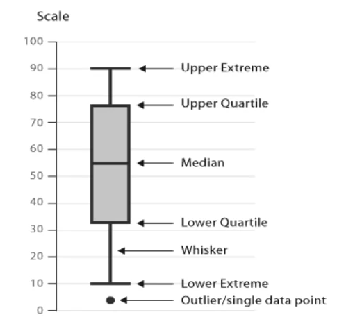
Box Plots
Box plots allow to compress a lot of information in a single graph, expressing the Upper Extreme (100%), Upper Quartile (75%), Median, (50%) Lower Quartile (25%) and Lower Extreme (0%), as well as outliers as dots. The data between the upper and lower quartiles represents the interquartile range, and the lower and upper extremes are calculated as 1.5 times the interquartile range. Box plots allow to see the distribution and skewness of the data.
import seaborn as sns
sns.boxplot(x="feature", y="target", data=df)
When the plotted features overlap significantly, it's an indicator that the variable would not be a good predictor of the target. Likewise, if the distribution of the features are distinct enough (do not overlap significantly), it's an indication of a good predictor for the target.
Scatter Plots
Each observation is represented as a point and show the relationship between two variables. The Predictor/Independent variables on x-axis is the variable used to predict an outcome. The Target/Dependent variable on y-axis
import matplotlib.pyplot as plt
y = df["target"]
x = df["predictor"]
plt.scatter(x,y)

plt.title("Scatter Plot")
plt.xlabel("Predictor")
plt.ylabel("Target")
Grouping
Find relationships between variables and determine hierarchy of variables that affect the most the target variable. In pandas the Groupby() method is used to group data into categories and can be applied to categorical variables and/or group into single or multiple variables
# Create a separate dataframe with only the variables of interest for current analysis
df_test = df[["predictor_1", "predictor_2", "target"]]
# Groups by the two predictor variables and mean of the target
df_grp = df_test.groupby(["predictor_1", "predictor_2"], as_index = False).mean()
Pivot
Using Pivot, visualization and understanding becomes easier. A pivot table has one variable displayed along the columns and the other variable displayed along the row
df_pivot = df_grp.pivot(index "predictor_1", columns = "predictor_2")
Often, we won't have data for some of the pivot cells. We can fill these missing cells with the value 0, but any other value could potentially be used as well. It should be mentioned that missing data is quite a complex subject and is an entire course on its own.
df_pivot = df_pivot.fillna(0) #fill missing values with 0
Heat Map
Thereafter, the pivot table can be then plotted using a heat map. Heat map takes a rectangular grid of data and assigns a color intensity based on the data value at the grid points
plt.pcolor(df_pivot, cmap = "RdBu")
plt.colorbar()
plt.show()
Correlation
Correlation is a statistical metric for measuring to what extent different variables are interdependent, i.e., when looking at two variables over time, how one variable changes affect the other variable. It's important to note that correlation does not mean causation, so that by pure correlation one cannot tell if A causes B or vice versa.
Positive/Negative Linear Relationship
Using a regression line. The steepness of the line represent the strength of the relationship and whether or not a correlation is present. If the linear regression line does not go through all/most of the scatter plot points, its representing a weak linear relationship between the selected predictor variable and the target
sns.regplot(x = "predictor", y = "target", data = df)
plt.ylim(0,)
Statistics
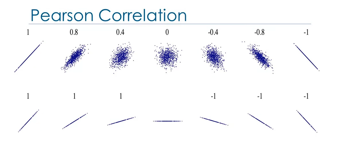
Pearson Correlation
It's a measure of the strength of the correlation between continuous numerical variables. It will return two values: the correlation coefficient and the P-value.
Correlation Coefficient:
- Close to +1: Large Positive relationship
- Close to -1: Large Negative relationship
- Close to 0: No relationship
P-value: Indicates how certain the correlation calculation is
- P-value < 0.001: Strong certainty in the result
- P-value < 0.05: Moderate certainty
- P-value < 0.1: Weak certainty
- P-value > 0.1: No certainty
from scikit-learn import stats
pearson_coef, p_value = stats.pearsonr(df["predictor"], df["target"])
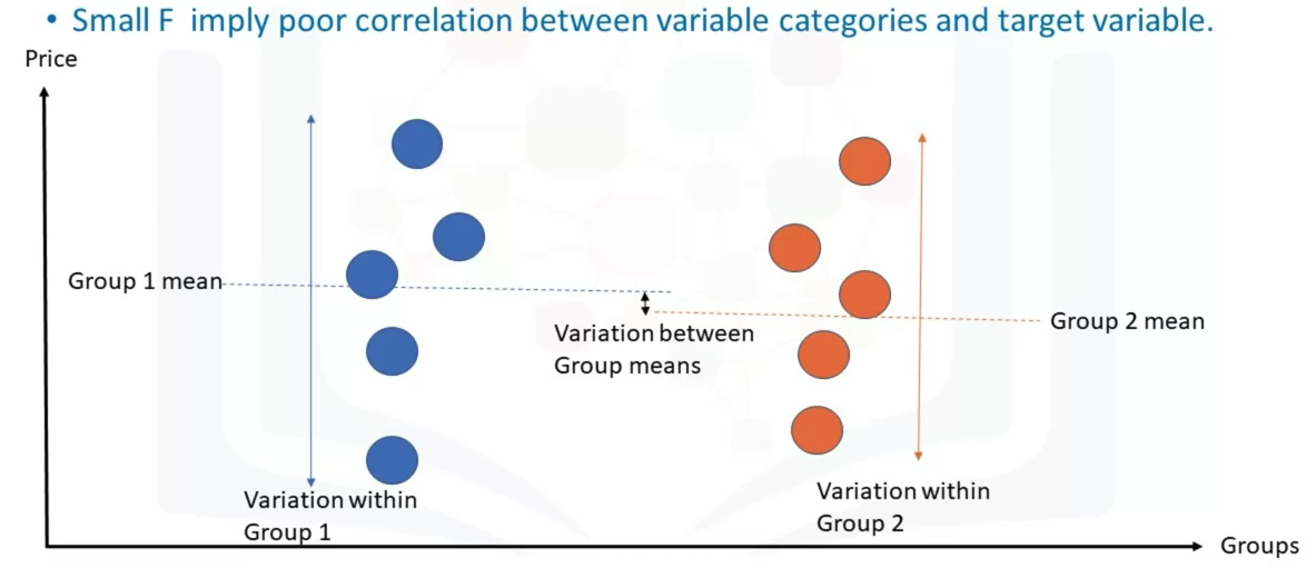
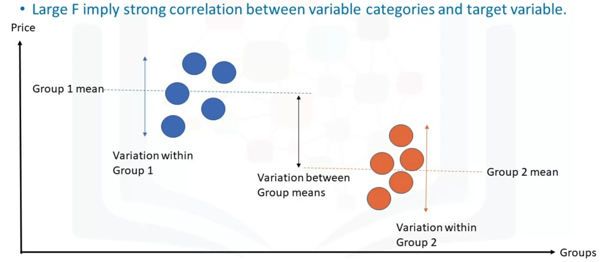
Analysis of Variance (ANOVA)
Analyze a categorical variable and see the correlation among different categories. ANOVA can be used to find the correlation between different groups of a categorical variable. This returns two values, the F-test score which indicates the ratio of the variation between each sample group means, and P-value which indicated the degree of confidence. The F-test calculates the ratio of variation between groups means over the variation within each of the sample group means.
df_anova = df[["predictor","target"]]
grouped_anova = df.anova.groupby(["predictor")]

anova_results = stats.f_oneway(grouped_anova.get_group("predictor_category_1")["target"], grouped_anova.get_group("predictor_category_2")["target"])
Code Snipplets
Correlation
# Creates a rectangular matrix with correlation coefficients
# Diagonal elements are always one. Heatmap can be then plotted for this table
df.corr()
df[["feature 1", "feature 2", "feature n"]].corr()

df.corr()['target'].sort_values()
Descriptive Statistics
# For numerical data
df.describe()
df.describe(include=["object"])

# For categorical data
df["predictor"].value_counts()
df["predictor"].value_counts().to_frame() # Returns a dataframe

drive_wheels_counts = df['drive-wheels'].value_counts().to_frame()
drive_wheels_counts.rename(columns={'drive-wheels': 'value_counts'}, inplace=True)
drive_wheels_counts.index.name = 'drive-wheels'
drive_wheels_counts
Grouping
df['predictor'].unique() # To show how many unique categorial features exist
Heat Map
fig, ax = plt.subplots()
im = ax.pcolor(grouped_pivot, cmap='RdBu')

#label names
row_labels = grouped_pivot.columns.levels[1]
col_labels = grouped_pivot.index

#move ticks and labels to the center
ax.set_xticks(np.arange(grouped_pivot.shape[1]) + 0.5, minor=False)
ax.set_yticks(np.arange(grouped_pivot.shape[0]) + 0.5, minor=False)

#insert labels
ax.set_xticklabels(row_labels, minor=False)
ax.set_yticklabels(col_labels, minor=False)

#rotate label if too long
plt.xticks(rotation=90)

fig.colorbar(im)
plt.show()